Archive

Monthly Archives: January 2013

Happiness Machines.

Part one documents the story of the relationship between Sigmund Freud and his American nephew, Edward Bernays who invented Public Relations in the 1920s, being the first person to take Freud’s ideas to manipulate the masses.

This series is about how those in power have used Freud’s theories to try and control the dangerous crowd in an age of mass democracy. Sigmund Freud, the founder of psychoanalysis, changed the perception of the human mind and its workings profoundly.

His influence on the 20th century is widely regarded as massive. The documentary describes the impact of Freud’s theories on the perception of the human mind, and the ways public relations agencies and politicians have used this during the last 100 years for their engineering of consent. Among the main characters are Freud himself and his nephew Edward Bernays, who was the first to use psychological techniques in advertising. He is often seen as the father of the public relations industry.

Freud’s daughter Anna Freud, a pioneer of child psychology, is mentioned in the second part, as well as Wilhelm Reich, one of the main opponents of Freud’s theories. Along these general themes, The Century of the Self asks deeper questions about the roots and methods of modern consumerism, representative democracy and its implications. It also questions the modern way we see ourselves, the attitude to fashion and superficiality.

///

The Century Of The Self 1 of 4 | One: Happiness Machines

///

The Century of The Self Part 2 of 4

///

The Century of The Self Part 3 of 4

///

The Century of The Self Part 4 of 4.

///

The Century Of  Self (FULL: Episodes 1-4)

///

Grids – Rosalind Krauss

Source: October, Vol. 9 (Summer, 1979), pp. 50-64
Published by: The MIT Press

Stable URL: http://www.jstor.org/stable/778321

krauss-grids PDF

http://uncopy.net/wp-content/uploads/2011/08/krauss-grids.pdf

///

Extract

“In the early part of this century there began to appear, first in France and then in Russia and in Holland, a structure that has remained emblematic of the modernist ambition within the visual arts ever since. Surfacing in pre-War cubist painting and subsequently becoming ever more stringent and manifest, the grid announces, among other things, modern art’s will to silence, its hostility to literature, to narrative, to discourse. As such, the grid has done its job with striking efficiency. The barrier it has lowered between the arts of vision and those of language has been almost totally successful in walling the visual arts into a realm of exclusive visuality and defending them against the intrusion of speech. The arts, of course, have paid dearly for this success, because the fortress they constructed on the foundation of the grid has increasingly become a ghetto. Fewer and fewer voices from the general critical establishment have been raised in support, appreciation, or analysis of the contemporary plastic arts. 

Yet it is safe to say that no form within the whole of modern aesthetic
production has sustained itself so relentlessly while at the same time being so
impervious to change. It is not just the sheer number of careers that have been
devoted to the exploration of the grid that is impressive, but the fact that never
could exploration have chosen less fertile ground. As the experience of Mondrian
amply demonstrates, development is precisely what the grid resists. But no one
seems to have been deterred by that example, and modernist practice continues to
generate ever more instances of grids.”

///

Jasper Johns

Jasper Johns. Gray Numbers. 1958

///

Tron Lightbike Scene

///

A Brief History of Grids

By Lucienne Roberts

http://www.graphics.com/modules.php?name=Sections&op=viewarticle&artid=620

Extract

This spread and throw-out is from Jan Tschichold’s seminal workAsymmetric Typography, originally published in 1935. In it Tschichold argued that typographic consistency is a necessary precursor to understanding, and described designers as akin to engineers. His work was nevertheless aesthetically refined and dynamic. Here he explains the parallels between abstract art and typographic layout.

de Stijl, the Bauhaus, and Jan Tschichold
In 1917 Dutch architect, designer, and painter Theo van Doesburg founded de Stijl. The importance of this movement to the grid is that it explored form as determined by function, and placed this in a political context. Arguing that simplicity of form was accessible and democratic, its members advocated minimalism, using only rectilinear forms, and eradicating surface decoration other than as a byproduct of a limited color palette: the primaries plus black and white. The typographers affiliated to de Stijl wanted to apply these ideas in the real world, not just for their artistic cause. Designers like Piet Zwart and Paul Schuitema used these principles to produce commercial advertising and publicity materials.

The Bauhaus opened its doors in Weimar, Germany, in 1919, with the architect Walter Gropius as its Director. His belief that architecture, graphic art, industrial design, painting, sculpture, and so on were all interrelated had a profound impact on the development of typography and graphic design long after the school was forced to close by the Nazis in the 1930s. Within an astonishingly short period of time, graphic artists were marrying analytical skills with abstract form to arrive at mass-produced designs determined as much by political idealism as by a desire for self-expression. In 1925, Herbert Bayer was appointed to run the new printing and advertising work-shop. He paid attention to typographic detail, experimenting with a limited typographic palette in order to achieve greater visual clarity and easily navigable pages.

During the late 1920s and the 1930s, typographer Jan Tschichold set out his typographic principles in two seminal books: The New Typography (1928), and Asymmetric Typography (1935). Tschichold’s work was more refined than much of that which had preceded it. He wrote of typographic consistency as a necessary precursor to understanding, described designers as akin to engineers, and argued compellingly for asymmetry as a central tenet of modernism. It was the logical way to lay out text that is read from left to right, and produced “natural” rather than “formalist” solutions to the new design challenges than classicism, with its enforced central axis. In his work Tschichold explored subtle horizontal and vertical alignments, and used a limited range of fonts, type sizes, and type weights.

Several post-War Swiss designers are the best-known exponents of the grid. This spread is from Josef Müller-Brockmann’s Grid Systems in Graphic Design, in which he explains, in meticulous detail, how multicolumn and field-based grids can be used flexibly to achieve any number of different layouts, in both 2-D and 3-D work.
The ingenuity of the “A” paper sizing system appeals to designers who are interested in modular approaches to design. For the true modernist, working with standard paper sizing is more economic and celebrates mass production. But, for designers who want to usurp the system, there are countless ways to subdivide the sheet sizes to arrive at more unusual formats.

The Grid and Swiss Typography
Early modernists had explored layout, space, and scale. They had talked of the democratizing benefits of mass production, and had used the language of science as much as art. They had argued for consistency and minimalism as a mark of design confidence and greater accessibility. During WWII, and in the decades that followed, these ideas coalesced into a coherent design manifesto with a new design device at its core—the grid.

The grid and Swiss typography are synonymous. Switzerland was neutral during the war. Not only did it attract many intellectual refugees, including designers like Jan Tschichold, but also most peacetime activities continued as normal, and supplies of such things as ink and paper weren’t rationed. Added to this, publications had to be set in its three official languages—French, German, and Italian—which called for a modular approach, using multiple column structures.

Several Swiss artist/designers, most notably Max Bill and Richard Paul Lohse, explored systematic forms in their paintings concurrently with graphic design, while the graphic designers Emil Ruder and Josef Müller-Brockmann both wrote educative texts explaining what grids were and how to use them. They approached the subject with great rigor, arguing passionately that “integral design” required structures that would unite all the elements in both 2-D and 3-D design: type, pictures, diagrams, and space itself. Despite their enthusiasm for order and precision, they both understood the value of artistic intuition.

“No system of ratios, however ingenious, can relieve the typographer of deciding how one value should be related to another… He must spare no effort to tutor his feeling for proportion… He must know intuitively when the tension between several things is so great that harmony is endangered. But he must also know how to avoid relationships lacking in tension since these lead to monotony.”
Emil Ruder, Typography

The grid and the design philosophy of which it is a part have been criticized for placing the narcissistic designer at the heart of the solution, and generating formulaic solutions that are mechanistic, unyielding, and rigid. But for Ruder, Müller-Brockmann, and many other designers since, the grid was the natural response to a design problem. It was also a metaphor for the human condition, and was found in all areas of human endeavor.

“Just as in nature, systems of order govern the growth and structure of animate and inanimate matter, so human activity itself has, since the earliest times, been distinguished by the quest for order… The desire to bring order to the bewildering confusion of appearances reflects a deep human need.”
Josef Müller-Brockmann, Grid Systems in Graphic Design

Josef Müller-Brockmann Animated Posters

///

Chuck Close explains why he follows a grid 

Chuck Close explains why he follows a grid

///

ARTIST SERIES: David Carson

///

The Work of Art in the Age of Mechanical Reproduction

///

pasaport_benjamin

Full text can be found at: http://www.marxists.org/reference/subject/philosophy/works/ge/benjamin.htm

///

Summary: The Work of Art in The Age of Mechanical Reproduction

February 28, 2008 by ginal

In his essay, “The Work of Art In The Age of Mechanical Reproduction”, Walter Benjamin discusses a shift in perception and its affects in the wake of the advent of film and photography in the twentieth century. He writes of the sense changes within humanity’s entire mode of existence; the way we look and see the visual work of art has is different now and its consequences remain to be determined. How does human sense perception related to history? Is it a universal perspective that is being critiqued here? Can there be a universal perspective in the first place?

///

WAYS OF SEEING (first episode) 1/4

//

Benjamin here attempts to mark something specific about the modern age; of the effects of modernity on the work of art in particular. Film and photography point to this movement. Benjamin writes of the loss of the aura through the mechanical reproduction of art itself. The aura for Benjamin represents the originality and authenticity of a work of art that has not been reproduced. A painting as an aura while a photograph does not; the photograph is an image of an image while the painting remains utterly original.

///

WAYS OF SEEING (first episode) 2/4

///

The sense of the aura is lost on film and the reproducible image itself demonstrates a historical shift that we have to take account of even if when we don’t necessarily notice it. What does it mean when the aura is lost? How does it function and how does it come about? Benjamin writes of the loss of the aura as a loss of a singular authority within the work of art itself. But what comes through in this new space left by the death to the aura? How does the mechanically reproduced work of art manage to make up for this void?

///

WAYS OF SEEING (first episode) 3/4

///

As Benjamin continues, a tension between new modes of perception and the aura arise. The removal of authority within the original work of art infers a loss of authority, however, in regards to mass consumption, this liberation is not necessarily contingent. The cameraman, for example, intervenes with what we see in a way which a painting can never do. It directs the eye towards a specific place and a specific story; at the same time it is radical and revolutionary it is also totalitarian. It guides us to a particular side of a story and leaves other parts out. It dulls our perception towards the work of art and introduces distraction as a mode of reception. The location of anything we might call the aura has to be moved into a mythological space; into the cult of genius. This cult of genius relates back to the cultish characteristic of the aura itself; in its absence there is a grabbling for a replacement. What does it mean to place an aura on “someone” or “something”? Is it even necessary to reclaim the aura in the first place? The mystical cult of the original in broken with the loss of the aura, and now every one can go to a gallery, a museum, the theater or the cinema. A whole new appreciation of art is introduced while at the same time, a whole new mode of deception and distraction also enters.

///

WAYS OF SEEING (first episode) 4/4

///
For Benjamin, the aura is dead and it exists in an improbable and mystical space. But in the making of our own myths therein lies an aesthetic interpretation of these reproducible images; there is a temporal world that is there for you, where you do not truly participate. The object consumes man at the same time man consumes it. Mass consumption revels in this consequence of the loss of the aura. For Benjamin, a distance from the aura is a good thing. The loss of the aura has the potential to open up the politicization of art, whether or not that opening is detrimental or beneficial is yet to be determined. However, it allows for us to raise political questions in regards to the reproducible image which can be used in one way or another.

///

a07-hear-hitl-300

“Adolf, the Superman: Swallows Gold and
Spouts Rubbish” (1932) by 

John Heartfield

///

Yet Benjamin makes it clear that in this new age of mechanical reproduction the contemplation of a screen and the nature of the film itself has changed in such a way that the individual no longer contemplates the film per say; the film contemplates them. A constantly moving image in the disjunction of the physical arrest of watching a moving image move, changes the structure of perception itself. Within the reproducibility of images there is an increase of submission towards the film itself. In and of itself this marks a symptom and not a cause of something terrible that is happening. How can we think of subjectivity in the age of mechanical reproduction? What does it mean to reflect back onto ourselves after being absorbed by these inauthentic and politicized images? What does the aestheticization of the work of art mean now when the aura is lost?

///

Josef-Müller-Brockmann-poster1

Josef Muller-Brockmann: Swiss Automobile club poster (“Watch that Child!”)

///

Key passages:

“During long periods of history, the mode of human sense perception changes with humanity’s entire mode of existence. The manner in which human sense perception is organized, the medium in which it is accomplished, is determined not only by nature but by historical circumstances as well” (Benjamin, 222).

“The surgeon represents the polar opposite of the magician. The magician heals a stick person by the laying on of hands; the surgeon cuts into the patient’s body. The magician maintains the natural distance between the patient and himself; though he reduces it very slightly by the laying on of hands, he greatly increases it by virtue of his authority. The surgeon does exactly the reverse; he greatly diminishes the distance between himself and the patient by penetrating into the patient’s body, and increases it but little by the caution with which his hand moves among the organs. In short, in contrast to the magician—who is still hidden in the medical practitioner—the surgeon at the decisive moment abstains from facing the patient man to man; rather , it is through the operation that he penetrates into him” (Benjamin, 233).

///

ComplPntgLdV2

An array of Mona Lisa Adaptations
as published in The Complete Paintings of Leonardo da Vinci

See: http://www.studiolo.org/Mona/MONA23.htm for more details

///

“The act of reaching for a lighter or a spoon is familiar routine, yet we hardly know what really goes on between hand and metal, not to mention how this fluctuates with our moods. Here the camera intervenes with the resources of its lowerings and liftings, its interruptions and isolations, its extensions and accelerations, its enlargements and reductions. The camera introduces us to unconscious optics as does psychoanalysis to unconscious impulses”(Benjamin, 237).

“Let us compare the screen on which a film unfolds with the canvas of a painting. The painting invites the spectator to contemplation; before it the spectator can abandon himself to his associations. Before the movie frame he cannot do so. No sooner has his eye grasped a scene than it is already changed. It cannot be arrested….The spectator’s process of association in the view of these images is indeed interrupted by their constant, sudden change. This constitutes the shock effect of the film, which, like all shocks, should be cushioned by heightened presence of mind. By means of its technical structure, the film has taken the physical shock effect out of the wrappers in which Dadaism had, as it were, kept it inside the moral shock effect” (Benjamin, 238).

“The distracted person too, can form habits. More, the ability to master certain tasks in a state of distraction proves that their solution has become a matter of habit. Distraction is provided by art presents a covert control of the extent to which new tasks have become soluble by apperception. Since, moreover, individuals are tempted to avoid such tasks, art will tackle the most difficult and most important ones where it is able to mobilize the masses. Today it does so in film. Reception in a state of distraction, which is increasing noticeably in all fields of art and is symptomatic of profound changes in apperception, finds in the film its true means of exercise”(Benjamin, 240).

“Mankind, which in Homer’s time was an object of contemplation for the Olympian gods, is now one for itself. Its self-alienation has reached such a degree that it can experience its own destruction as aesthetic pleasure of the first order. This is the situation of politics which Fascism is rendering aesthetic. Communism responds by politicizing art”(Benjamin, 242).

///

The Uncanny

Featuring works by Adeline de Monseignat and Berndnaut Smilde

Curated by James Putnam

Opening 16 January 2013

Ronchini Gallery London presents The Uncanny featuring new works by two young artists, Adeline de Monseignat and Berndnaut Smilde, curated by James Putnam from 16 January – 16 February 2013. The Uncanny draws on each artist’s relationship with their materials and the ways in which they create a sense of unease for the viewer by using the familiar out of context.

The exhibition’s theme is partly inspired by Sigmund Freud’s celebrated 1919 essay of the same title. Based on the notion that the strange could not exist without the non-strange, Freud’s study pioneered the distinctive nature of the uncanny as a feeling of something not simply weird or mysterious but, more specifically, as something strangely familiar. Freud’s concept of the uncanny and his interpretation of dreams had a significant influence on the Surrealist movement and their depiction of the unnatural and strange.

Dutch-Monegasque artist de Monseignat creates sculptures and installations from organic and tactile materials such as fur, a material suspended between life and death, often encased in glass. Her works have an uncertainty as to whether they are animate or inanimate objects. She refers to her creations as ‘creaptures’ as they are somewhere in between creatures and sculptures. Her kinetic works aim to create a sense of life through movement and mimic a slow breath. The creaptures thus hold a sense of presence and their tactile qualities elicit in the spectator an unfulfilled desire to touch them.

Dutch artist, Berndnaut Smilde produces striking images of ‘real’ Nimbus clouds suspended within empty rooms. Using a fog machine, he carefully adjusts the temperature and humidity to produce clouds just long enough to be photographed. There is a unique ephemeral aspect to the work where the photograph captures a very brief moment before the cloud dissipates and disappears again as mysteriously as it was formed. His choice of lighting and viewing aspect enables him to create a representation of the cloud’s physicality. Smilde’s work looks at transience and challenges the physicality of space.

 About the artists

Adeline de Monseignat (b. 1987, Monaco) lives and works in London. She was awarded the Catlin Art Prize, Visitor Vote Prize (2012) and was long listed for The Threadneedle Prize (2012). She studied at Slade School of Fine Art, Parsons The New School, New York and City & Guilds of London Art School.

Berndnaut Smilde (b. 1978, Groningen) lives and works in Amsterdam. Smilde’s work has been exhibited at Out of Focus, Saatchi Gallery, London (2012) and Red Sky at Night, Mercer Union, Toronto (2012). Smilde holds an MA from the Frank Mohr Institute, Groningen. Awards include a starter stipend from The Netherlands Foundation for Visual Arts, Design and Architecture. He was a resident artist at the Irish Museum of Modern Art, Dublin in 2008.

 About the Curator

James Putnam is an independent curator and writer based in London. He founded and was curator of the British Museum’s Contemporary Arts and Cultures Programme from 1999 to 2003. He was also a former curator of the British Museum’s Department of Egyptian Antiquities. He has organized a number of critically acclaimed exhibitions for major museums juxtaposing the work of contemporary artists with their collections. Recently he was a curator for the 2010 Busan Biennale in South Korea, and the collateral events ”Distortion” and “Library” at the 53rd Venice Biennale. His book Art and Artifact: The Museum as Medium, published by Thames & Hudson, surveys the interaction between contemporary artists and the museum. He was Visiting Scholar in Museum Studies at New York University and currently lectures in Curatorial Studies at Central Saint Martins, University of the Arts, London.

 About Ronchini Gallery

Ronchini Gallery is a contemporary art gallery founded by Lorenzo Ronchini in 1992, in Umbria, Italy, which expanded in February 2012 with a space in Mayfair, London. Its exhibitions have explored pioneering movements within Italy; the gallery aesthetic is defined by Minimalism, Spatialism, Conceptualism and Arte Povera and it retains an unblinking future-focus on progressive movements. Ronchini Gallery evolved from 20 years of private collecting. Paterfamilias Adriano Ronchini was an early supporter of artists such as Alighiero Boetti, Daniel Buren, Joseph Kosuth, Frank Stella and Michelangelo Pistoletto and collected their work throughout the seventies. Subscribing to the highest standards of curatorship and scholarship, the gallery provides a rigorous context in which its artists can be viewed. Ronchini Gallery also maintains a successful publishing arm which produces exhibition catalogues, monographs, critical texts and artist’s books.

Exhibition Facts: The Uncanny: Adeline de Monseignat and Berndnaut Smilde

Exhibition Dates: 16 January – 16 February 2013

Opening Reception: 15 January 2012

Opening Hours: Monday – Friday 10am–6pm, Saturday 10am – 5pm

Location: 22 Dering Street, London, W1S 1AN

Tel: +44 (0) 207 629 9188 Website: http://www.ronchinigallery.com

For press information and images please contact:

Sophie da Gama Campos or Toby Kidd at Pelham Communications

Tel: +44 (0) 208 969 3959 Email: sophie@pelhamcommunications.com or toby@pelhamcommunications.com

///

“Uncanny”

Uncanny PDF

 “The German word unheimlich is obviously the opposite of heimlich, heimisch, meaning “familiar,”  “native,”  “belonging to the home”; and we are tempted to conclude that what is “uncanny” is frightening precisely because it is not known and familiar. Naturally not everything which is new and unfamiliar is frightening, however; the relation cannot be inverted. We can only say that what is novel can easily become frightening and uncanny; some new things are frightening but not by any means all. Something has to be added to what is novel and unfamiliar to make it uncanny.” (Freud 1919:2)

 From: The “Uncanny” by Sigmund Freud (found at http://web.mit.edu/allanmc/www/freud1.pdf)

(First published in Imago, Bd. V., 1919; reprinted in Sammlung, Fünfte Folge. [Translated by Alix Strachey.]

ringu460

Ringu: https://www.youtube.com/watch?v=_B4kUi-aIF8

///

The Uncanny Valley  https://www.youtube.com/watch?v=CNdAIPoh8a4

Criminal-Minds-Episode-5-12-The-Uncanny-Valley-Promotional-Photos-criminal-minds-9444230-459-308

///

Graphics and the uncanny: http://www.eyemagazine.com/blog/post/graphics-and-the-uncanny

Breton

///

Uncanny Surrealism and Graphic Design: http://www.kunsthal.nl/en-22-689-pers-Uncanny.html

Karel Teissig, Lady Törless : Mladý Törless, 1967

///

Jan Svankmajer and the Graphic Uncanny:

http://observatory.designobserver.com/feature/jan-svankmajer-and-the-graphic-uncanny/30398/

Svankmajer_525

///

Alice by Jan Švankmajer: https://www.youtube.com/watch?v=bosvfUoO0DU

Alice

///

 The Uncanny and the Fantastic: 

Stubbs Zebra

“The fantastic therefore leads a life full of dangers, and may evaporate at any moment.

It seems to be located on the frontier of two genres, the marvellous and the uncanny,

rather than to be an autonomous genre.”

Tsvetan Todorov, The Fantastic (Ithaca: Cornell UP, 1975)

Found at: http://graduate.engl.virginia.edu/enec981/Group/chris.uncanny.html

What is the Fantastic? 

“The fantastic requires the fulfillment of three conditions.  First, the text must oblige the reader to consider the world of the characters as a world of living persons and to hesitate between a natural or supernatural explanation of the events described.  Second, this hesitation may also be experienced by a character; thus the reader’s role is so to speak entrusted to a character, and at the same time the hesitation is represented, it becomes one of the themes of the work–in the case of naive reading, the actual reader identifies himself with the character.  Third, the reader must adopt a certain attitude with regard to the text:  he will reject allegorical as well as “poetic” interpretations (Todorov 1975:33).”

From: The Fantastic: A Structural Approach to a Literary Genre (1975), Tzvetan Todorov  http://www.unc.edu/~bardsley/ghosts/todorov.html

https://www.youtube.com/watch?v=cy7ztJ3NUMI

https://www.youtube.com/watch?v=cy7ztJ3NUMI

///

The Shining by Stanley Kubrick:

https://www.youtube.com/watch?v=cy7ztJ3NUMI

Kubrick Carpet

http://kubrickfilms.tripod.com/id80.html

chair3.jpg.w560h373

 ///

All Eyes on View
Jan 2nd, 2013 @ 01:55 am › Steven Heller

20130102-163841.jpg

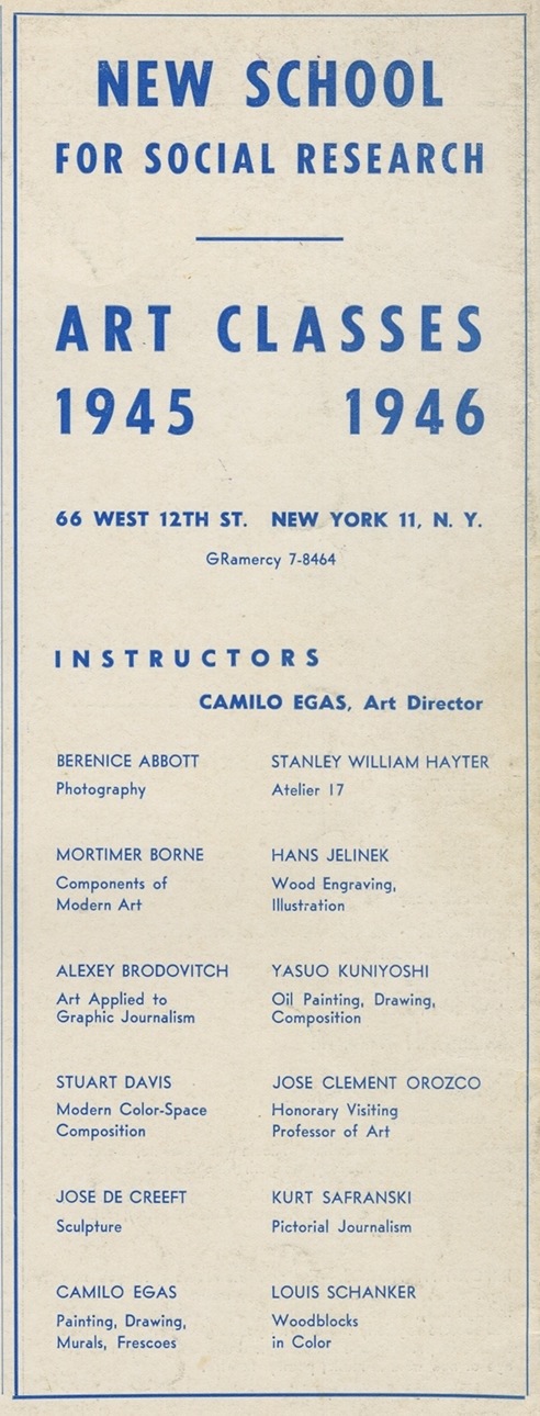
You may have seen View magazine before. It is not one of the forgotten ones. It is a legendary one that is always interesting to revisit. It was edited by John Henri Ford, a surrealist poet from Mississippi. View included writing and art by Paul Bowles, Philip Lamantia, Harold Rosenberg, Aaron Copland, and Marcel Duchamp, among others. The issue below with Duchamp’s cover is devoted to the artist who designed the collage pages inside. The Morris Hirshfield primitive covers an issue on “The Macabre.” And look at the advertisement below for The New School art classes—some great teachers made the grade.

The following text is excerpted from my book Merz to Emigre and Beyond: Avant Garde Magazine Design of the Twentieth Century:

View: Through the Eyes of Poet’s New York’s first Surrealist journal appeared in September 1940 as a six-page tabloid. Edited by poet Charles Henri Ford, the former American editor for the London Bulletin, the British surrealist revue published by the London Gallery between 1938 and 1940, View’s mission for its seven year duration (36 numbers in 32 issues) was to fill the void of European avant garde periodicals that ceased with the war. Ford positioned his publication between the “little magazine” transition (the vanguard journal edited in Paris by Eugene Jolas and Elliot Paul between 1927 and 1938) and Minotaure. After View’s 1941 “Surrealist issue” edited by Nicolas Calas it became the most important American surrealist publication, featuring text and visual contributions from all the principles in the circle.

20130102-164056.jpg

20130102-164107.jpg

By 1943 View shifted from the tabloid to a more standard magazine format printed on slick paper with full color covers and the occasional gatefold. This increased the financial burden of production that the maximum 3000 paid circulation did not cover, so to maintain a regular quarterly publishing schedule Ford accepted relatively expensive advertisements for fashions and perfumes, among those already for books, periodicals, and other cultural events. Associate editor, Parker Tyler was in charge of View’s typography and graphic design and produced a highly sophisticated graphic persona on a par with Minotaure and yet unique to View. The covers created by Surrealist standard bearers, Andre Masson, Man Ray, Kurt Seligmann, and Marcel Duchamp, as well as other modern artists, Alexander Calder, Fernand Léger, and Georgia O’Keeffe, were the most adventuresome of any American magazine. Moreover, these were not paintings arbitrarily placed on the covers but images designed especially for this venue. Occasionally, the common View masthead (set in a Bodoni typeface) was designed by the cover artist: Isamu Noguchi’s 1946 cover is a superb example of this transformation: Here the letters of View are sculptural elements reading diagonally down the page and bracketing the sculpture is the centerpiece of the cover.

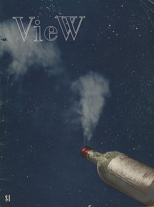
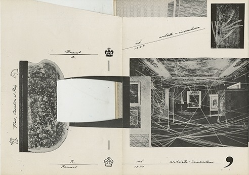
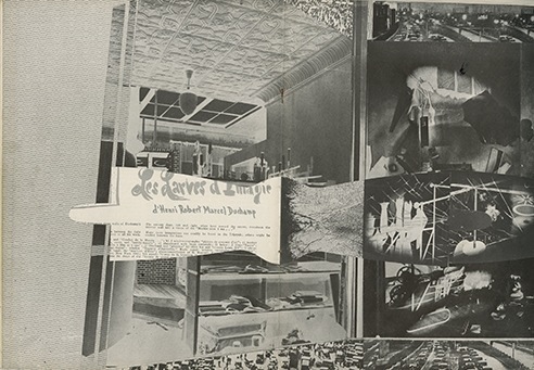
View covered the Dada experience and introduced the key surrealists to New York. Andre Breton’s first American interview was published here. An entire issue (1942) was devoted to Max Ernst with article on him by Breton; and a spectacular issue (1945) featured Duchamp, complete with layouts designed by the artist — this being the first monograph ever published of his work. An essay by Peter Lindamood describes the technical machinations involved in, and thereby demystifies, the creation of Duchamp’s View cover, a montage of a smoking wine bottle. He explained how this master of “art-plumbing expediency” rigged up a smoke pipe under the bottle and then manipulated the various halftone layers to achieve the desired effect. In this and other articles View gave Surrealist art a human context that was curiously absent in the pseudo-scientific and hyper analytic writing found in the earlier European journals.

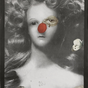
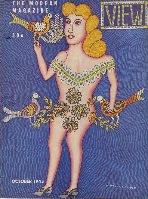
Coverage of the European vanguard was only a part of the editorial menu. Ford felt a duty to bridge the transatlantic gap by bringing Americans into the Surrealist fold and in 1943 View was the first to publish Joseph Cornell’s earliest “found art” compositions (“The Crystal Cage: Portrait of Berenice”). It gave outlet to the emerging American vanguard writers and artist-writers, including Henry Miller, Marianne Moore, William Carlos Williams, Alexander Calder, and others. But Ford also published the naïve and self-taught Surrealists, notably the African-American artist Paul Childs. Morris Hirshfield, whose beguilingly detailed and folk paintings were discovered by Sidney Janis in the thirties, was also part of the View community. Hirshfield’s 1945 cover intricately rendered cover of a cleverly veiled nude was surrealism at its most slyly innocent.

20130102-164326.jpg

20130102-164343.jpg

View celebrated the artist as visionary and Surrealism as a wellspring of artistic eccentricity. In its role as avant garde seer the magazine overstepped the bounds of propriety, and therefore in 1944 was banned by the U.S. Postal Service presumably for publishing nudes by Picasso and Michelangelo. However, despite its confrontational stance and the debates about Marxism, Communism, and Trotskyism that were carried on in European Surrealist circles, View did not advocate ideological political activity, but rather supported the right of individual artistic freedom – and eclecticism. “View’s editors thought it delusional to believe that art could ever serve any cause other than its own,” wrote Catrina Neiman in View: Parade of the Avant-Garde (Thunder Mouth Press, New York, 1991), who further notes while certain poets of the day urged opposition to the inevitable world war, “View printed no editorials denouncing the war.” Though it did maintain a pacifist stance that supported conscientious objection.

View caused its share of acrimony among the skirmishing groups who sought dominance for their respective art forms. Surrealism was not universally admired, and The Partisan Review, a left-leaning intellectual journal, declared that Surrealism was both decadent and dead, endorsed abstract art as the new avant garde art. This was no mere preferential disagreement but a contest for what genre and which artists would dominate the museums, galleries, and private collections. View tried to preserve Surrealism’s importance and so ignored competing arts. Yet this advocacy was not so much militancy over an ideological cause, but a campaign for the hegemony of style.

View was a significant outlet for Surrealism it was also uncommitted to the movement as a “party,” and thus became an instrument for popularizing the avant garde. Surrealism as a style was, no pun intended, ready-made as an advertising trope. “Ford did not disdain commercial avenues of support,” states Catrina Neiman, “…on the contrary, he knew not only how to navigate capitalism but hoe to appreciate (appropriate) its imagery, namely through the lens of camp, a ‘view’ that converged with surrealism then and with Pop Art twenty years later.” Despite the paid advertising, however, View ceased publishing in 1949.

For more Steven Heller, check out The Education of an Art Director—one of the many Heller titles available at MyDesignShop.com.

Categories: Daily Heller, Steven Heller
Tags: Daily Heller, Steven Heller, View magazine

Read more: All Eyes on View | Imprint-The Online Community for Graphic Designers

///